|
Name |
Description |
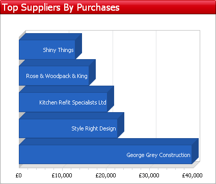 Shows you the top 5 suppliers by purchases over the previous 12 months. | |
.png) This chart displays your purchases for the past 12 months. The coloured bands show how much of each months purchases was contributed by each type of risk category. For example if you have a large portion of red in a particular month then this means you bought a large amount of supplies from 'Maximum Risk' or 'High Risk' companies. Having a large portion of red could be of concern if these suppliers supply critical goods or services that you cannot easily replace. If the goods or services are critical to your business then you should seek some form of guarantee... more | |
.png) This pie chart merges how much you currently owe the suppliers in your accounts system with their risk category taken from Experian. This gives you a breakdown of how much money you owe to high risk, average risk and low risk companies. It also shows you how much money you owe to companies that you are not currently monitoring. | |
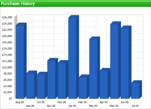 This bar-chart displays the value of your monthly purchases for the previous 12 months. | |
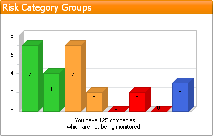 Displays the number of supplier accounts in each risk category that you are monitoring. There are 8 risk categories displayed from left to right as follows:
The total number of suppliers from your accounting system that you are not monitoring is displayed underneath the chart. |


