|
Name |
Description |
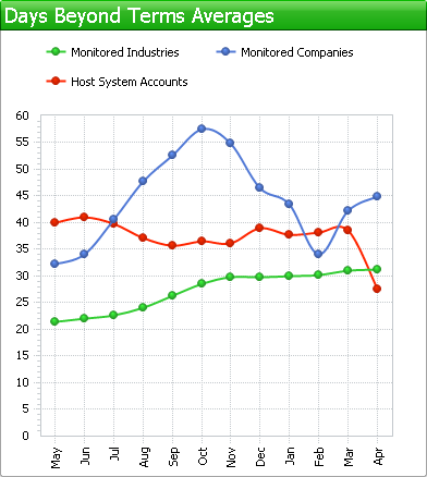 The chart shows you a monthly average over the last 12 months of how promptly the companies you are monitoring pay their bills and how promptly the customers from your accounts pay you. Up to three different series of data will be shown, depending if you have linked Credit Guardian to your accounts system and are monitoring companies.
| |
.png) This pie chart merges how much you are currently owed by the companies in your accounts system with their risk category taken from Experian. This gives you a breakdown of how much money you are owed by high risk, average risk and low risk companies. It also, importantly, shows you how much money is owed to you by companies that you are not currently monitoring. Using this chart can help you decided if its more important to chase money owed to you by high risk companies rather than low risk. | |
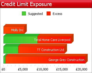 This displays up to 4 customers that owe you the most money beyond their recommended credit limit. The balance of the recommended credit limit from Experian is shown in green and any balance over the credit limit is shown in red. If there is no green portion then the recommend credit limit is zero. The larger the portion of red the more risk you are taking. | |
.png) This chart displays your turnover (sales) for the past 12 months. The coloured bands show how much of each months turnover was contributed by each type of risk category. For example if you have a large portion of red in a particular month then this means you sold a large amount to 'Maximum Risk' or 'High Risk' companies. Having a large portion of red is not necessarily of concern as you may not have given these companies credit (i.e. cash with order, cash on delivery, large upfront payment etc.) or the credit was backed up by a guarantee of some... more | |
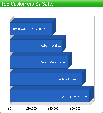 Shows you the top 5 customers by sales over the previous 12 months. | |
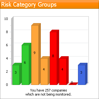 Displays the number of customer accounts in each risk category that you are monitoring. There are 8 risk categories displayed from left to right as follows:
The total number of customers from your accounting system that you are not monitoring is displayed underneath the chart. | |
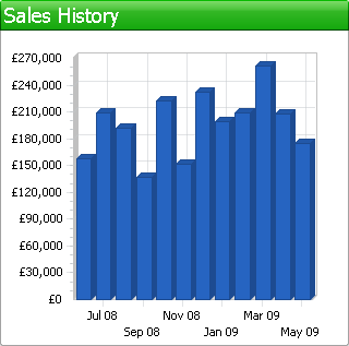 This bar-chart displays your monthly turnover history for the previous 12 months. |


